


.jpg)


.png)


USER GUIDE & DOCUMENTATION
Download supporting documetation using the links below:
GET IN TOUCH
Which Internet browser works best with OAG Schedules Analyser?
We recommend customers use Google Chrome. OAG Schedules Analyser can be slow or not show correctly on some browsers.
When is the data in OAG Schedules Analyser updated?
The data is updated every Monday. The date of the last update can be found at the top right hand side of the home screen in the box labelled ‘Database’.
What is the difference between pulling Published Carrier, Operating Carrier and Marketing Carrier?
The operating carrier is the airline which is responsible for operating the flight on the day. Many airlines enter into code-sharing agreements with other airlines; all code-sharing airlines may market and sell the flight, but only one airline can actually operate it. In some instances a different carrier may be contracted to operate the flight from the one which is published as the airline selling the flight and which has the airline designator and flight number for the flight.
What is the difference between one-way, two-way and aggregate route?
Selecting ‘one-way’ returns data from the database which shows the capacity from the specific origin to the specified destination only. ‘Two-way’ returns data for the same route but shows the capacity from the origin to the destination, as well as the destination to the origin as two separate records. Selecting ‘aggregate route’ combines data for the route in both directions and presents it as a single record. Note: Do not select ‘two-way’ and ‘aggregate route’ as this will provide an incorrect result.
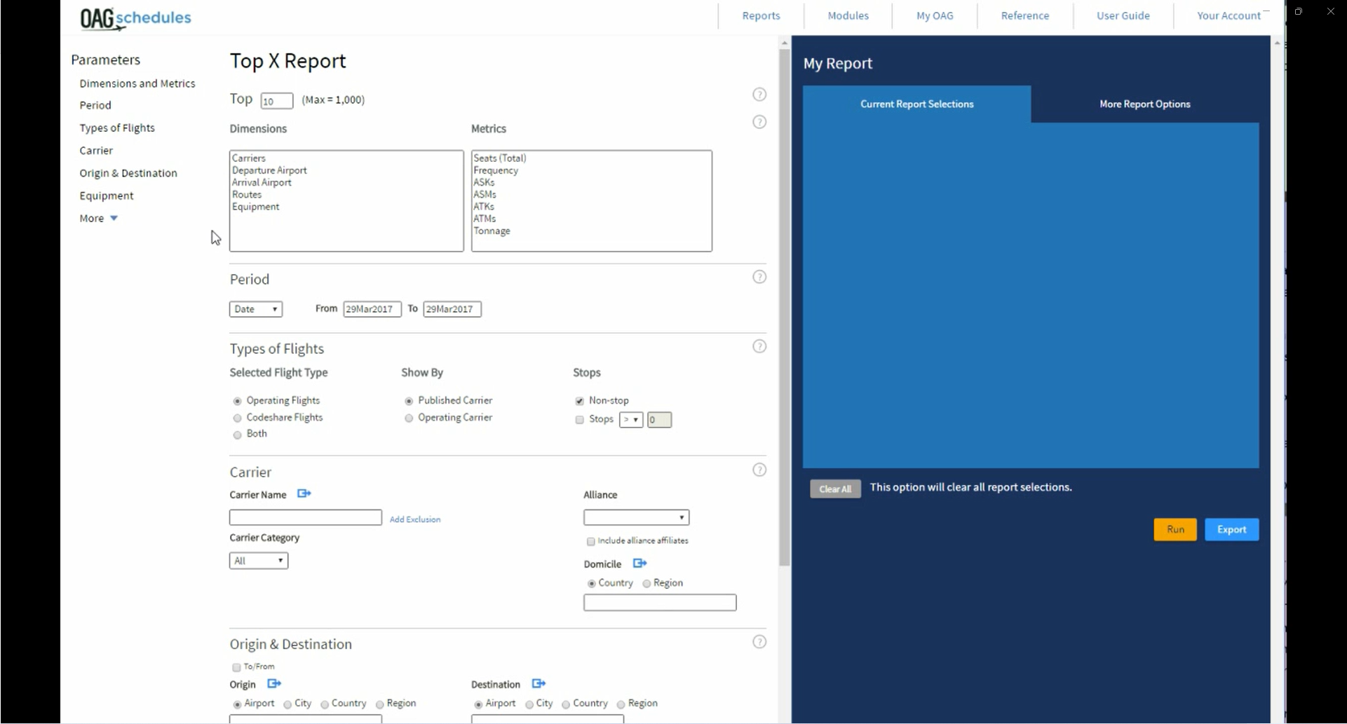
What is the difference between an O&D Pair and a Market Pair?
An O&D Pair is the airports at the start and end of the route, i.e. the origin and destination airport. In the PowerTable you can select fields described as O&D Pair (airport), O&D Pair (city), O&D Pair (State), O&D Pair (country) and O&D Pair (region). These fields show the airport pair, city pair, country pair etc associated with the origin and destination airport codes. A Market Pair refers to the combination of origin and destination, and places the two airports in alphabetical order. Market Pair (city) refers to the cities associated with the Market Pair. Here are some examples:
Why does ‘frequency’ not match ‘operating days’ in my query?
‘Operating days’ refers to the days of the week that the flight is scheduled to operate. If you have selected data for a period which includes only part of a week, or includes two periods with different patterns of ‘operating days’, the ‘frequency’ displayed will only include those operating days which fall within the selected time period.
Does OAG Schedules Analyser include connecting flights?
Schedules Analyser only contains Direct Flights (stopping and non-stopping, but with the same flight number throughout). Connections Analyser should be used to get schedules for connecting flights.
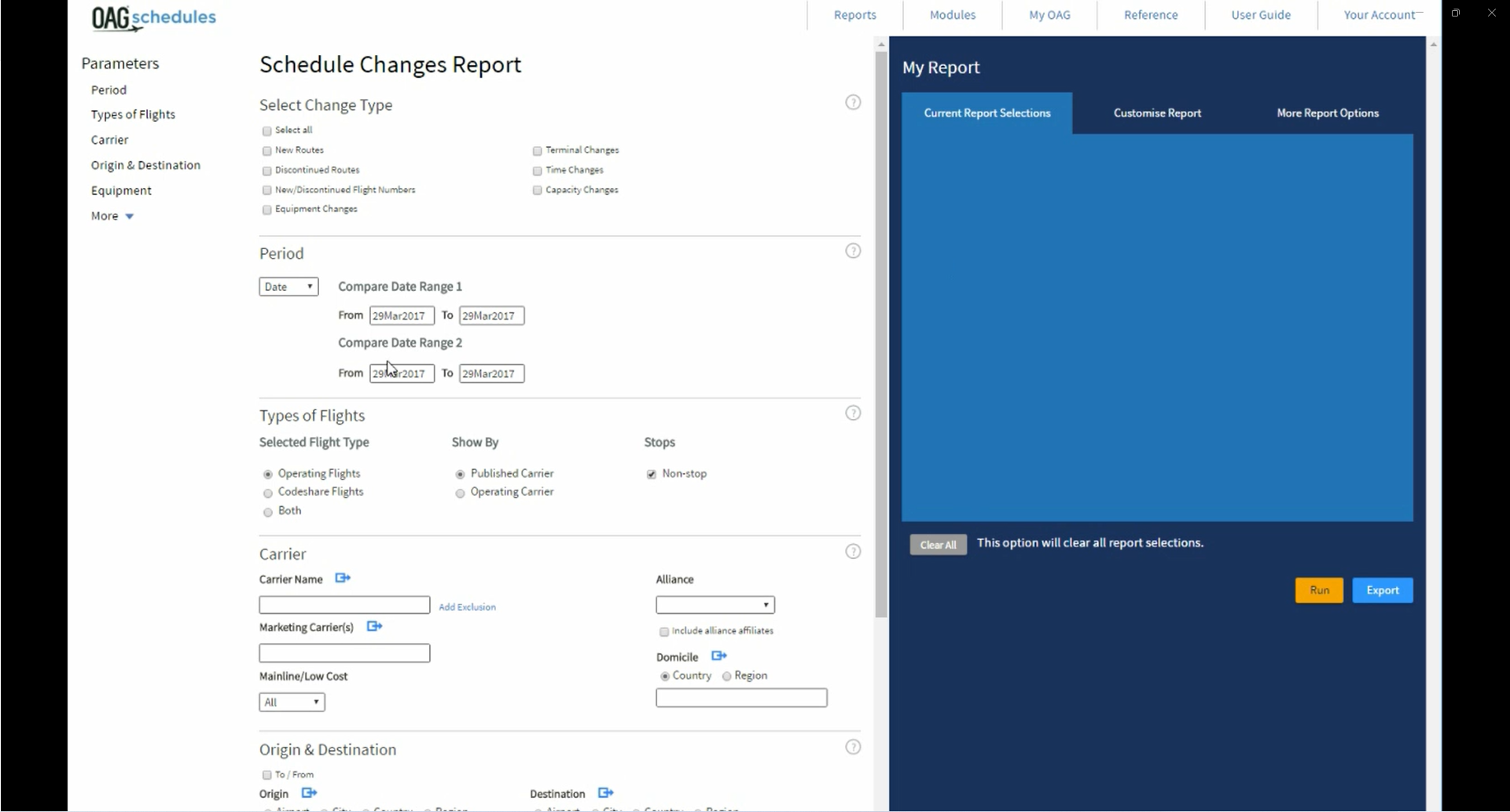
Why do you need to specify four dates in the Schedule Changes report?
The Schedules Changes report allows you to compare two date ranges, so the first two dates are the start and end of the first date range, and the third and fourth dates are the start and end of the second data range. It may be that you can use the same date selection to indicate both the start and end of each date range. For instance, comparing January 2013 with January 2014 could be done by stating a date range which starts in January 2013 and ends in January 2013, and comparing it with a second date range with starts in January 2014 and ends in January 2014. However you may want to select two date ranges which require the use four specific dates. For instance, to compare airline capacity over the US Thanksgiving weekend (Thursday to Sunday) in 2013 and 2014 would require date ranges of 28 November-1 December 2013 to 27 November to 30 November 2014.
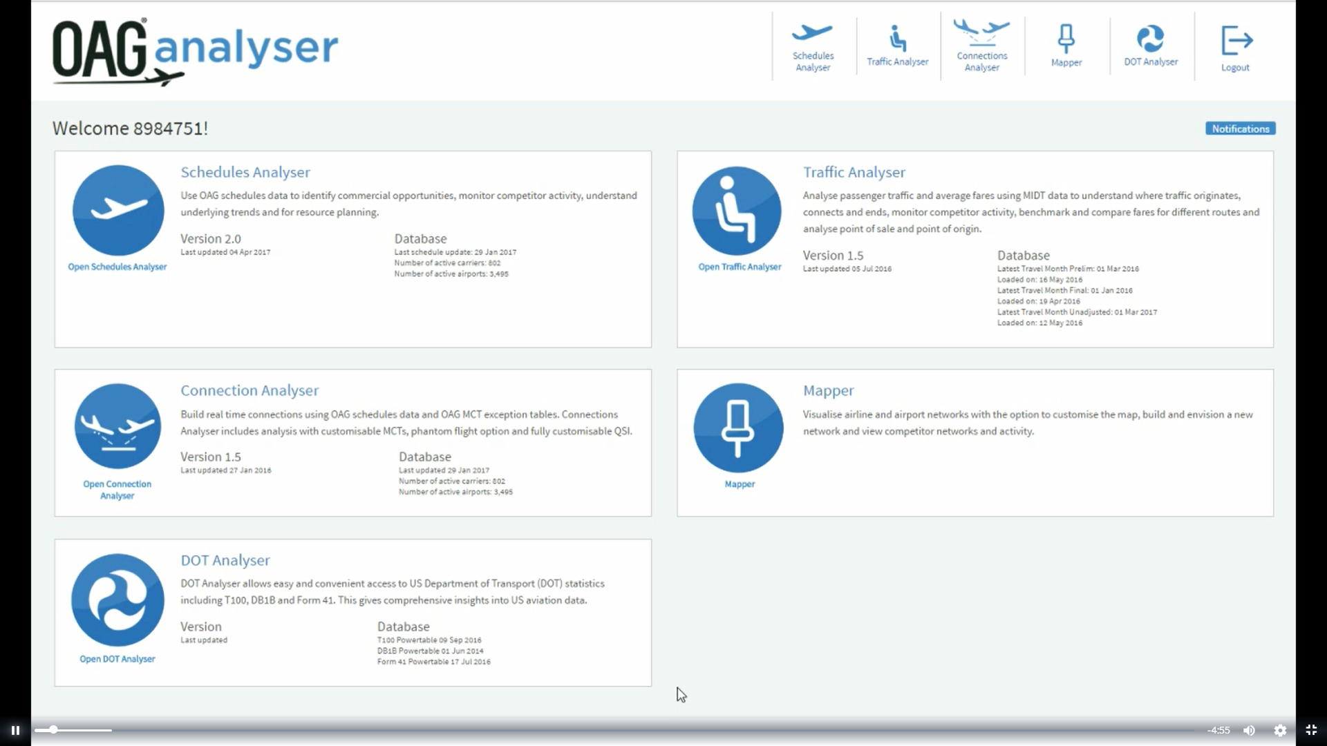
When I log out of Schedules Analyser, am I also logged out of OAG Analyser?
No. You are just logged out of the individual product but still logged on to the OAG Analyser dashboard (portal).
Are there any size limits on downloading and exporting the report?
Yes there are limits on downloading of these reports.
- for csv files - it is max size 512MB
- for pdf files - it is 1000 rows or 20MB
- for xlsx files - it is 1mln rows of data (the limit is in Excel)
When selecting airport or city names or codes, there are sometimes more than one which looks right. Which one should I use?
It doesn’t matter. You only need to select one of the names as Analyser pulls all the data for that name or code.
In the OAG Schedules Capacity report what counts as a hub airport?
You can select any airport as your ‘hub airport’. The term just means that the report pulls data for the airport and shows you the flights to and from the airport so you can see the extent to which the airport is functioning as a hub.
OAG Schedules Analyser offers a selection of pre-determined regions. What if I want to define my own regions?
OAG Schedules Analyser uses IATA’s regional definitions as follows:

You can create your own regions by using the group function, denoted by the link symbol. You can, for instance, create a group for Africa which consists of AF1, AF2, AF3 and AF4, or create regions based on a selection of countries.
In the ’Carrier Category’ field how does OAG decide if an airline is a mainstream carrier or a low cost carrier?
OAG makes a decision about this based on information about the carrier, including how the airline chooses to market itself.
Can I select data for a group of routes, rather than one route at a time?
Yes, you can use the ‘O&D Pairs’ feature at the bottom of the Schedule Capacity report and the Schedule Power Table. Clicking on ‘O&D Pairs’ gives you an option to manually enter up to XXX O&D pairs or you can paste in a selection of O&D pairs from another source.
Where surface data is included in OAG Schedules Analyser, where does this data come?
The data comes from train companies such as SNCF and Eurostar.
What does the ‘User Preferences’ option do in the ‘My OAG’ drop down box in OAG Schedules Analyser?
User Preferences allows you to select and save default setting such as the units you prefer to use and options for exporting data.
Do I need to select an option or enter a selection in every box in the query screen?
No. the selections you make are simply ways to narrow down the data to meet your requirements. For instance, if you select no carrier, the query pulls data for all airlines. Similarly, if you select no time period you will be extracting data from the entire OAG Schedules Analyser database. Obviously, to make analysis quick and meaningful it helps to carefully select only the data you need.
Why does it sometimes take a while for the data to be extracted?
If you have selected a large amount of data, the query will take longer than if you select a small volume of data. Make sure you have defined the data required as precisely as you can.