


.svg)
Edinburgh Airport
The data provided by OAG is extremely accurate and is so up to date that we can see what’s happening week to week in the market. The Schedules Analyser tool also complements work across the business, ensuring various teams can quickly access the data they need.
Will Green, Airline Executive, Aviation Team, Edinburgh Airport

AFRAA
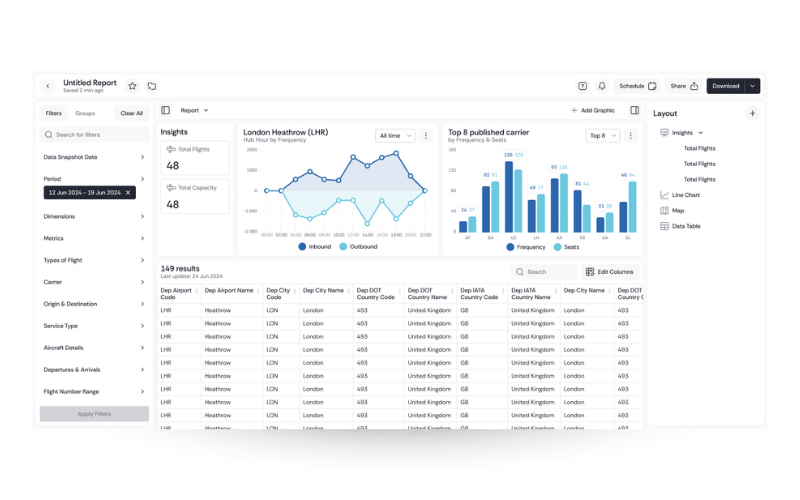
Insights generated from OAG Analyser empower airlines to turn raw operational flight data into actionable insights, improving airline efficiency, performance, and planning. Leveraging historical and real-time flight schedules enhances decision-making, drives strategic growth, and ensures competitive advantage in a dynamic aviation landscape through accurate and timely data intelligence.
Florah Ronoh, Manager, Data and Statistics at African Airlines Association (AFRAA)
Macau International Airport
OAG’s highly configurable analytical platform and modules can be tailored to our specific needs. The team continues to enable us to manage complexity, take advantage of opportunities, grow our business and delight our passengers, both today and in the future.
Eric Fong, Director of the Marketing department at Macau International Airport
Incheon Airport
Response times have been very fast and I’m sure that reflects the great working relationship and communication between various parts of OAG. If there is something I don't understand, I contact the local OAG person directly.
Vin Kim, Senior Manager, Incheon International Airport