


.jpg)


.png)


USER GUIDE & DOCUMENTATION
Download supporting documetation using the links below:
GET IN TOUCH
Why are the only time periods which can be selected ‘year’, ‘quarter’ and ‘month’? There is no option to select a ‘week’ or a ‘day’.
While schedule data has consistent patterns by day of week, airline traffic data does not. In order to make analysis meaningful, data is aggregated to a minimum period of one month.
What is the default Minimum Connect Time (MCT)?
It doesn’t matter. You only need to select one of the names as Analyser pulls all the data by code as long as the code is the same.
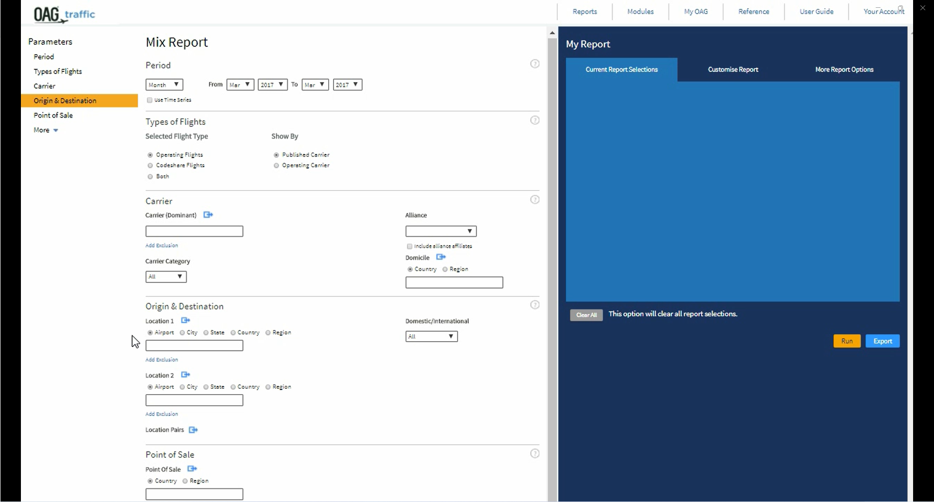
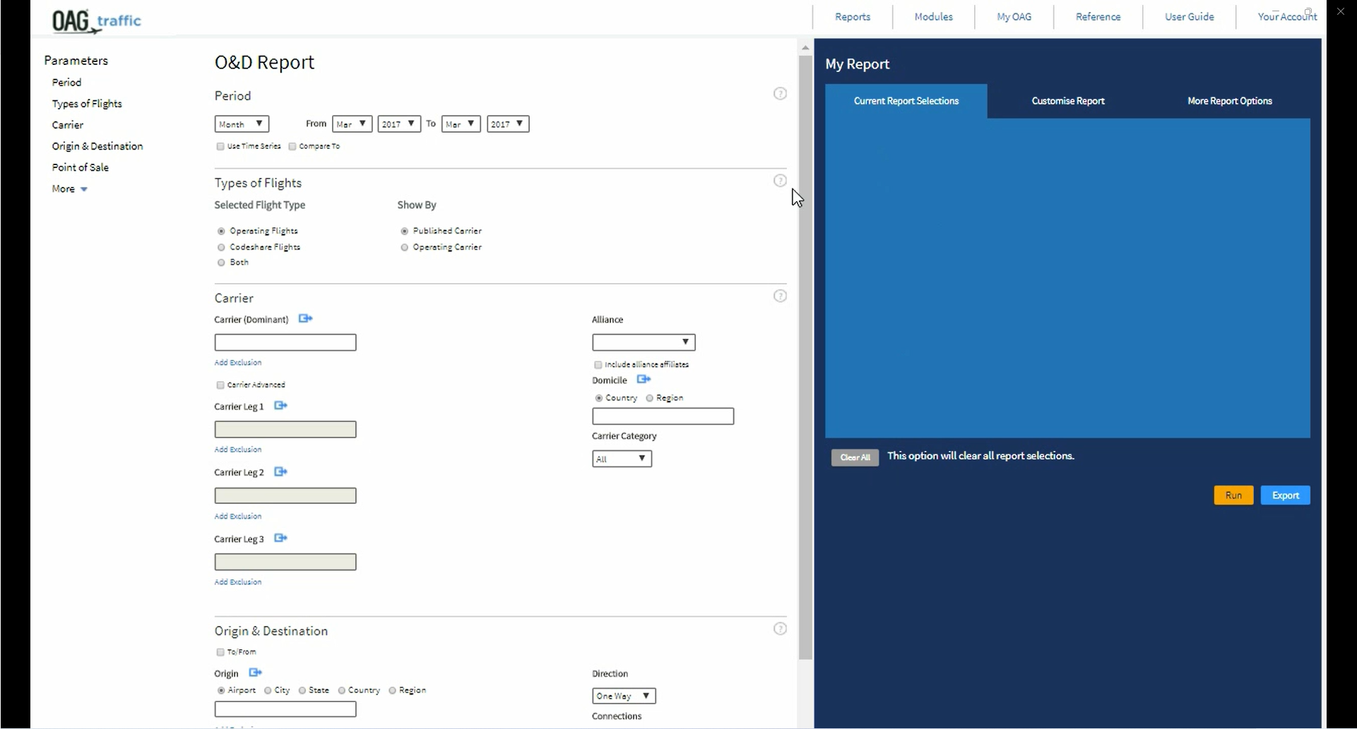
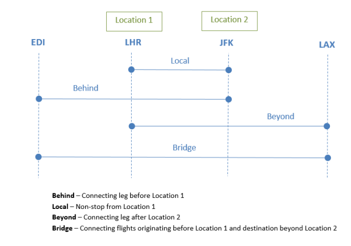
What is meant by ‘Mix’ and ‘Point of interest’ in the Mix Report?
The ‘Mix’ is the combination of the four types of passenger journeys represented on a single flight segment. These are ‘local’, beyond’, ‘behind’ and ‘bridge’ traffic.
− ‘Local’ traffic means those passengers flying non-stop on the flight segment.
− ‘Beyond’ traffic means those passengers flying onwards from the non-stop flight segment to another destination i.e. they take a connecting flight.
− ‘Behind’ traffic means those passengers who connected from another flight before travelling on this non-stop flight segment.
− ‘Bridge’ traffic means those passengers who connected onto this non-stop flight segment and will connect again onto another flight.
The diagram below illustrates each type of traffic.
What is the Point of Origin in the O&D report?
The Point of Origin for a booking is the place where the passenger started their journey. This means that it might be different to the ‘Origin’ for the flight segment(s) as the passenger might be travelling on the return leg of a booking.
Why is the data in different tabs sometimes different?
Each tab is calculated separately and sometimes numbers are rounded at different points in the calculation which means the numbers may not match exactly.
What is the Advanced Carrier function?
When you specify a carrier in a query in Traffic Analyser the default search presumes that the carrier is the dominant carrier on the routing, i.e. that the carrier is used for the longest leg of the routing. The Advanced Carrier function allows you to over-ride this and identify a specific carrier for any leg of the routing. This is especially useful when analysing traffic feed on short domestic sectors which feed long haul routes.
What is the Unserved function?
Traffic Analyser now includes a feature which allows the user to identify unserved routes.These are routes where there are passengers travelling between two points via connecting airports but there are no direct air services.
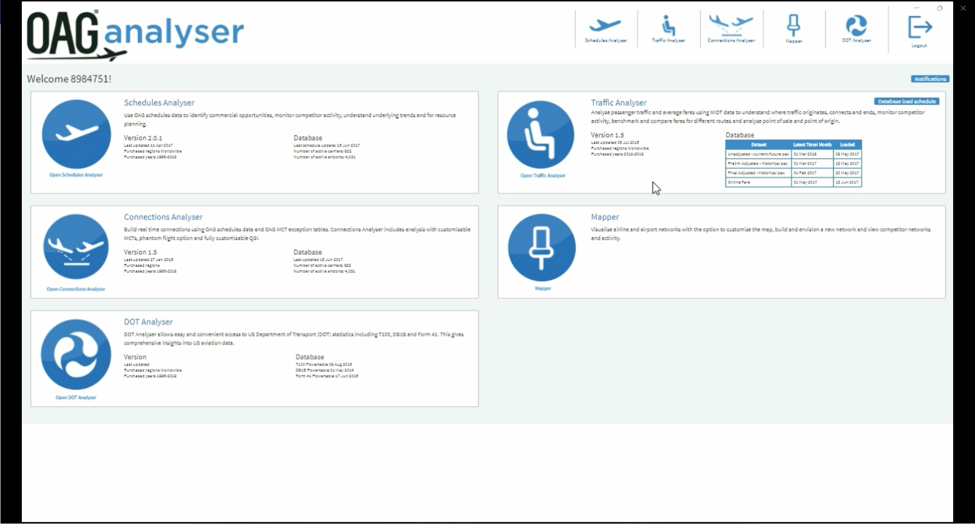
When I log out of Traffic Analyser, am I also logged out of OAG Analyser?
No. You are just logged out of the individual product but still logged on to the OAG Analyser dashboard (portal). If you are inactive on Traffic Analyser for 1 hour your session will timeout. Within the dashboard the inactive timeout is 12 hours. One user can have only one active session in the dashboard or Traffic Analyser at a time.