


.jpg)


.png)


CONNECTIONS ANALYSER RESOURCE CENTRE
Help videos, documentation & FAQs
HOW TO VIDEOS
DOCUMENTATION
USER GUIDE & DOCUMENTATION
Download supporting documetation using the links below:
GET IN TOUCH
FREQUENTLY ASKED QUESTIONS
Which Internet browser works best with OAG Connections Analyser?
We recommend customers use Google Chrome. OAG Schedules Analyser can be slow or not show correctly on some browsers.
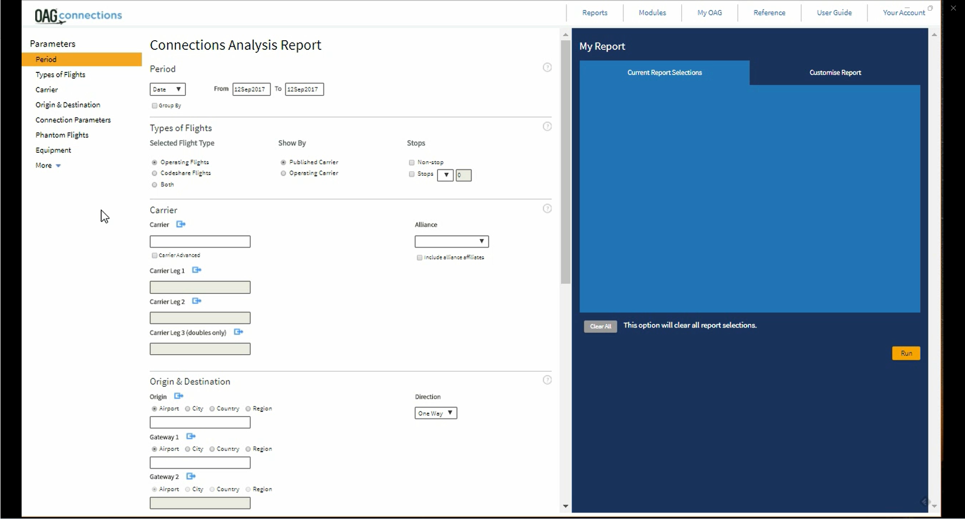
Do I need to select an option or enter a selection in every box in the query screen?
No. the selections you make are simply ways to narrow down the data to meet your requirements. However, we do recommend that you make your query as specific as possible in Connections Analyser as large queries may take a long time to process
What is the source of data in Connections Analyser?
Connections Analyser uses OAG’s schedules database to create potential itineraries with connecting flights. Airline schedules data for one year in the future is included, and historical data back to 1996 is available. Real connection times are created using predefined minimum/maximum connecting times as well as the OAG MCT exception table. Maximum and minimum connecting times can be adjusted to test the impact of changes to a flight schedule.
What is the Job Bin?
Any large query run in Connections Analyser is sent to the Job Bin where you can see the progress being made to process the query and you can open the report when it is ready. All items in the Job Bin are deleted automatically after 4 days so reports you need to keep should be saved.
Are reports I have run in OAG Connections Analyser retained in the Job Bin when I log out?
Yes, although you have the option to delete them from the Job Bin. You can also save them, send them to another user and export them.
Why is my report taking so long to process?
OAG Connections Analyser requires a lot of computer processing, even for relatively small queries and reports. If your query includes a long time period, or double connections, this significantly increases the amount of processing required. Any report which takes over an hour to process is timed out by OAG Connections Analyser.
When I run my query there appears to be no data. Why is this?
Look carefully at your query. Almost certainly this will be due to the way you have constructed your query.
What is Circuity?
Circuity is a term which reflects how far from the Great Circle Distance between the origin and destination is the actual routing when two or more flights connect. It is calculated as:
(aggregate distance of each flight leg) / (great circle distance between origin and destination of route) x 100
A non-stop flight would have a circuity of 100 as the distance of the flight leg would equal the great circle distance between the origin and destination.
A large circuity value applies where the hub airport at which two flights connect is further from the great circle route between the origin and destination of the route. Connections Analyser uses a default circuity of 150.
What is the default Minimum Connect Time (MCT)?
Connections are created using a predefined minimum connection time for the type of connection at the airport concerned, and a default maximum connection time of 8 hours. The OAG MCT exception tables enable the user to override either, or both, of these are test the impact of different maximum and minimum connecting times.
What is QSI?
QSI stands for Quality of Service Index and is a way to compare the attractiveness of one routing against another from a passenger perspective. These are used extensively by airline traffic forecasters who need to understand how the total volume of existing passenger traffic will be redistributed when new flight options are added, or the timing of existing flights are changed. QSI helps calculate market share.
As an example, a coefficient of 2.0 reflects an option which is estimated to be 8 times more attractive to a passenger than a coefficient of 0.25.
The OAG Connections Analyser Glossary contains a detailed listing of QSI parameters and default coefficients used by OAG.
What is a phantom flight?
A Phantom Flight is a fictitious flight you create which Connections Analyser treats as if it were part of the schedule database. You can use phantom flights as a means to test ‘what if…’ scenarios such as the impact on connectivity of adding new flights or code-sharing flights with another carrier. Phantom flights need to be created in the My OAG – Customise – Phantom Flights area of Connections Analyser. When you select an airline, the Phantom Flight fields will be automatically populated with the carrier’s typical aircraft type, and seats. Similarly, typical flight duration will automatically populate when you select an origin and destination. These default options can be overridden.
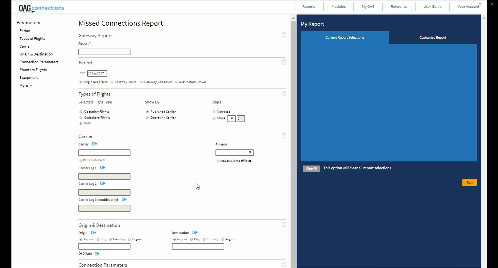
Can I use Connections Analyser to test the impact of changing the time of a flight?
Yes. You can use the Missed Connections report to see what connections would be possible if the flight time was moved forward or backward.
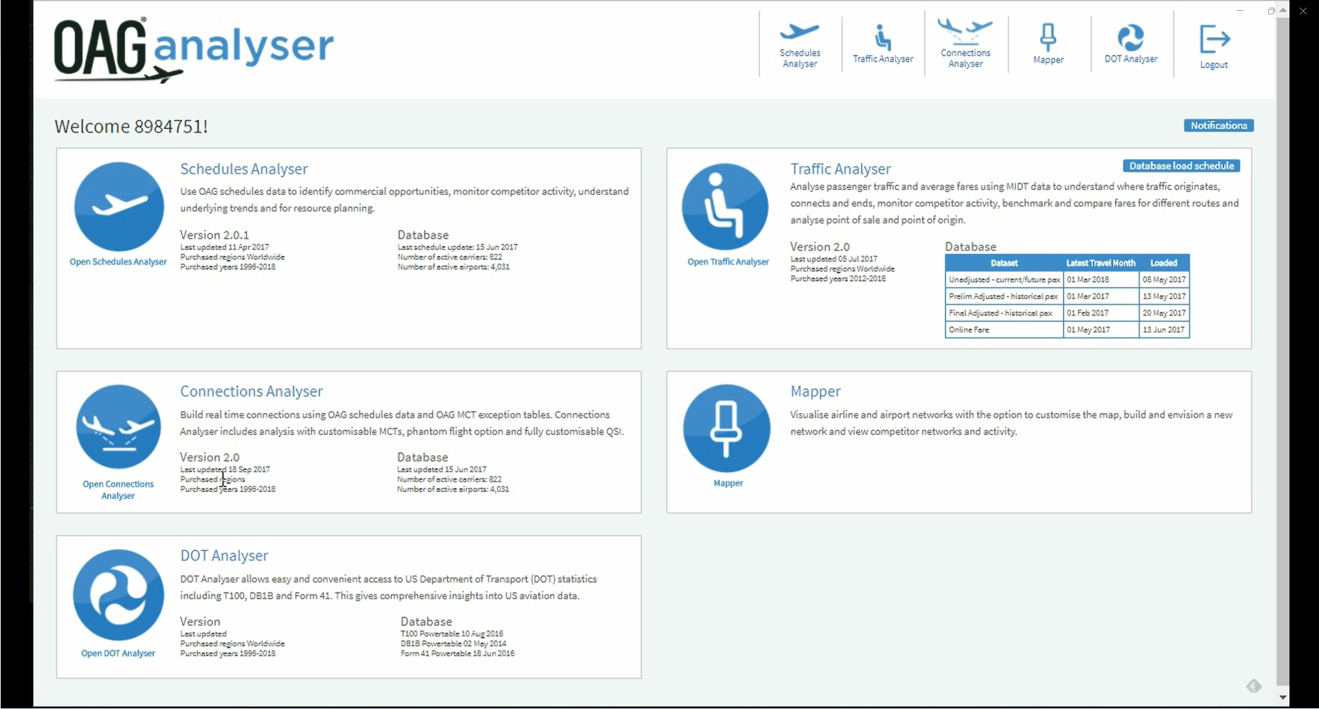
When I log out of Connections Analyser, am I also logged out of OAG Analyser?
No. You are just logged out of the individual product but still logged on to the OAG Analyser dashboard (portal). If you are inactive on Connections Analyser for 1 hour your session will timeout. Within the dashboard the inactive timeout is 12 hours. One user can have only one active session in the dashboard or Connections Analyser at a time.